Summary
As an eccommerce site focused on offering memberships as well as individual product purchases, it was important to continuously experiment with our marketing imagery and messaging. Below I'll walk you through one of the many product development lifecycles I lead during my tenure.
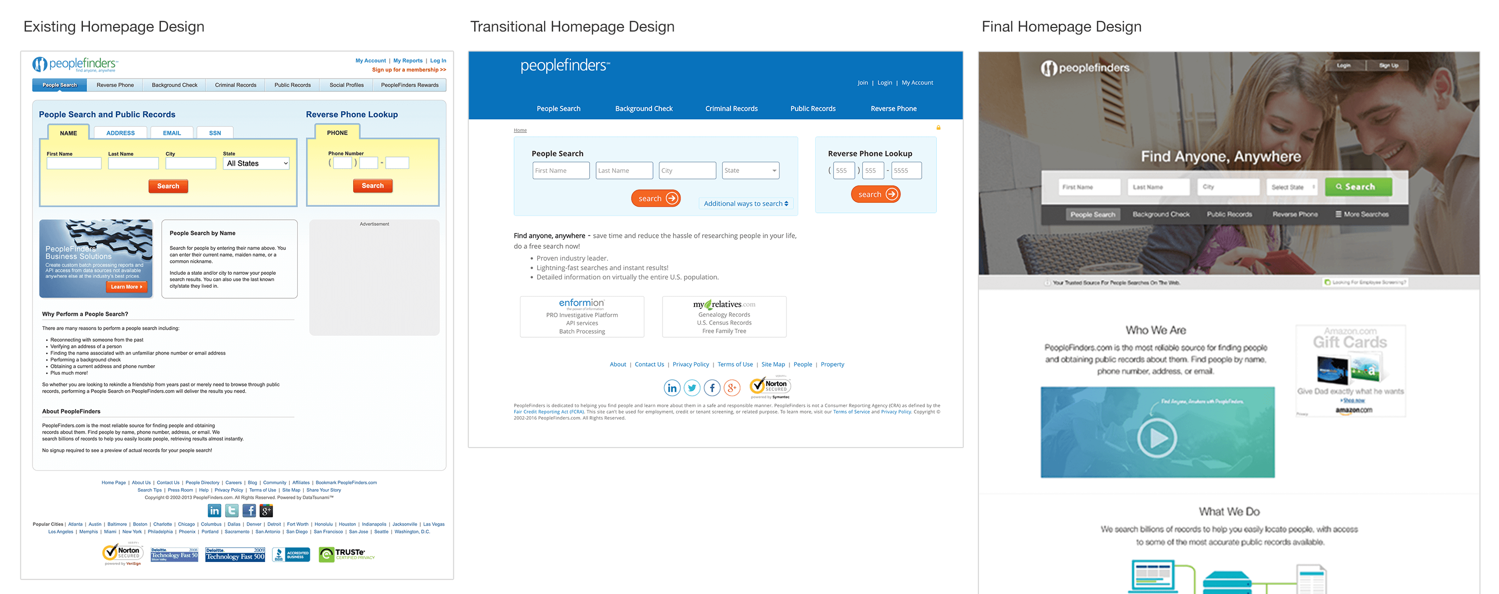
Redesign: Before, Trasitional, and After

Each year, the team was tasked with implementing a fresh redesign. The design decisions were based on what we learned from our sales, web analytics data, our competitors, and the general design trends. Our main home page as well as our marketing landing pages could receive upwards of 500,000 unique views a day. We were constantly running static and dynamic ads and seemed to build relationships with affiliate sites on a daily basis.
As this was the first major redesign of our site, I decided to take an interative approach. I knew users needed time to adjust to change and so moving major features like our search, login, and menu placement was out of the question. I decicded to apply a newer, clean style with updated content and subtle imagery for this transitional redesign. After a few months of continuous smaller changes we ended at our final redesign with a 30% increase in membership sales.

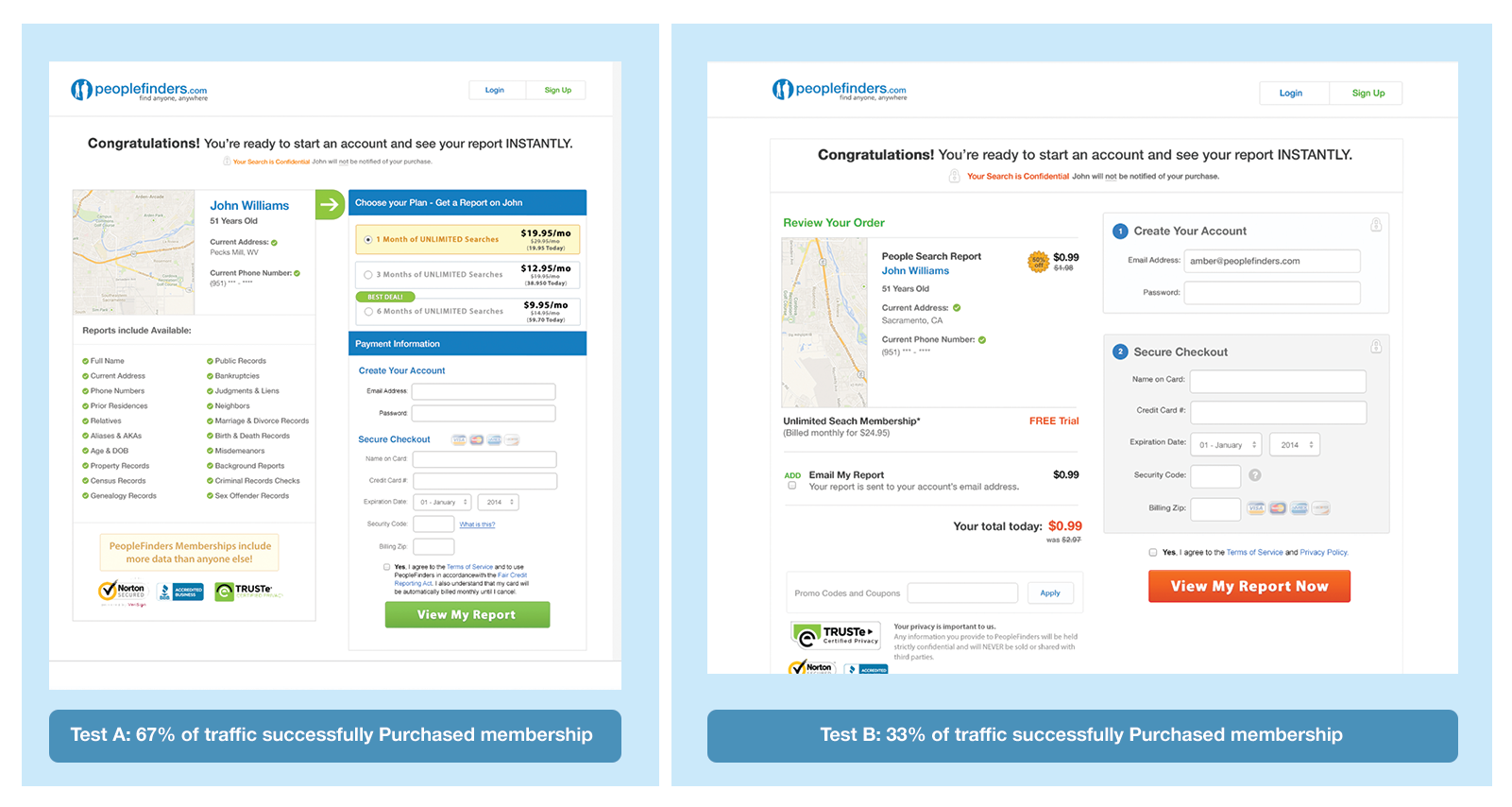
A/B Split Testing
We were sales first and that was reflected in every creative or development task we did. Split A/B testing was done almost daily to test the value of various placements for CTAs, messaging, and offers. It was a fast-paced environment that required an objective, data-driven approach to everything including the designs.
I was responsible for running the analytics reports weekly and sending the results for the week to our leadership. The numbers presented us with an unbiased look at how well various design and development decisions worked.
Sales Funnels: B2C
Sales funnels were the focus of any user flow. Our aim was to build interest and anticipation. Various psychological and UX techniques were used to invoke these emotions in our users. In the end we would offer discounts and upsells they could add on to their purchases.
Users needed to be guided to their product. We needed to tell an alluring story that answered their questions. People coming to our site wanted to know something either about themselves or someone else. Maybe it was a partner, a new hire, a random phone call, a new neighbor. They wanted to know if this person was safe, their location, family history, etc. In short, they wanted to play detective.
Creating a digital space where this felt possible was our goal.


Digital Advertising
A large part of our sales consisted of digital advertising. We would run ads on affiliates sites that were either static images or lead forms where users could enter their search and be taken directly our results page to buy their report.
Part of my role as the lead UX Designer and Developer was to work with the business on the parameter we wanted to pass, the most compeing imagery and content. We created hundreds of these while I was there and I got to see the evolution of web ads during my time there.
Lessons Learned
4 lessons I learned during my 4 years at peoplefinders.com:
- 1. If you want to sell successfully, you need to study your users behaviors and motivations constantly
- 2. Always test two versions of a page with your users
- 3. Stay one step ahead of the competition by studying trends within your industry
- 4. Take iterative approaches to redesigns to not confuse your users and affect sales.