Summary
In an effort to modernize and rebrand our association's image, the team set out to understand exactly what our members wanted. We spent months researching dentists and their employees at their offices, shadowing our customer service reps, and analyzing web analytics to understand the user behavior. We additionally needed to bring our site up to ADA compliance and web usabilty standards.
The Website Before Rebranding

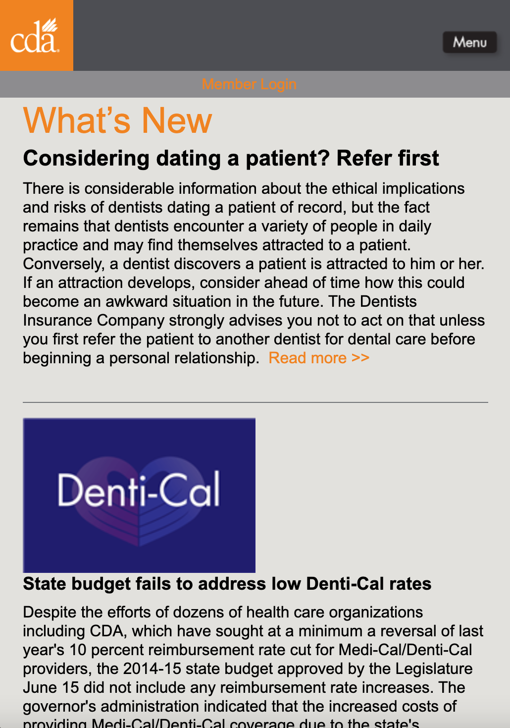
Member-Centric Site Optimization
Our team used the initial CDA.org homepage as a starting point and consulted with the Business Intelligence and Data Analytics department to learn more about CDA members and their behavior patterns. We supplemented these findings with our own research on best practices in usability, accessibility, and content strategy.
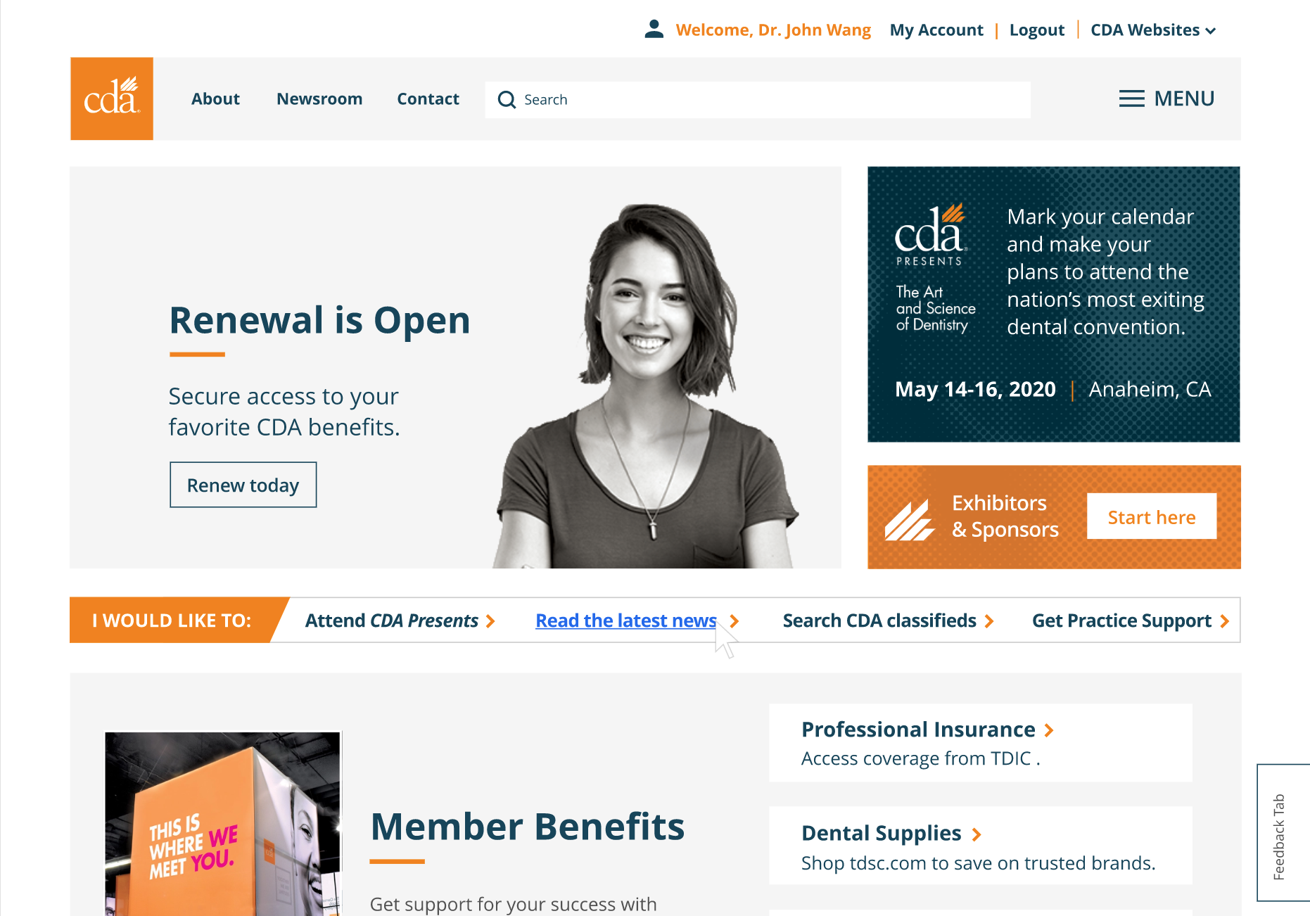
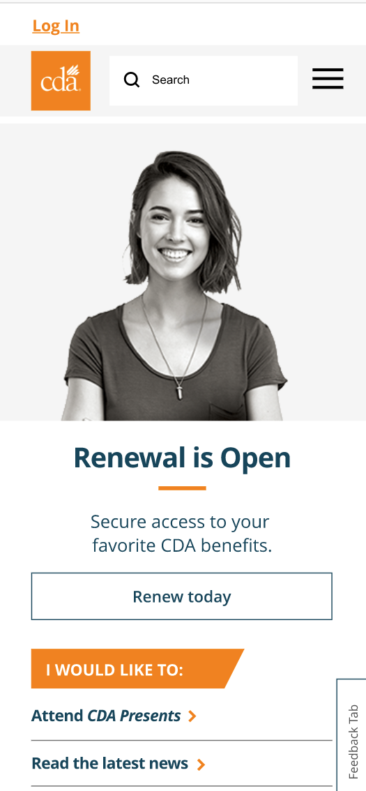
The homepage shows, not tells, the story of our organization and the value of our offerings. Features are selected based on usability and accessibility, and allows users more control over their decisions and behaviors. Content and layout are designed to reduce cognitive overload and guide users to finding the information they need without being directive. Above all, the intention is to provide users with the information they are seeking, not just the information we want them to have.
Project Details
- Tools Used: Adobe XD, Bootstrap, DNN (C#)
- Team Member Titles: UX Designer, UI Designer, UX Developer, Content Writer
The Website After Rebranding
Research Plan
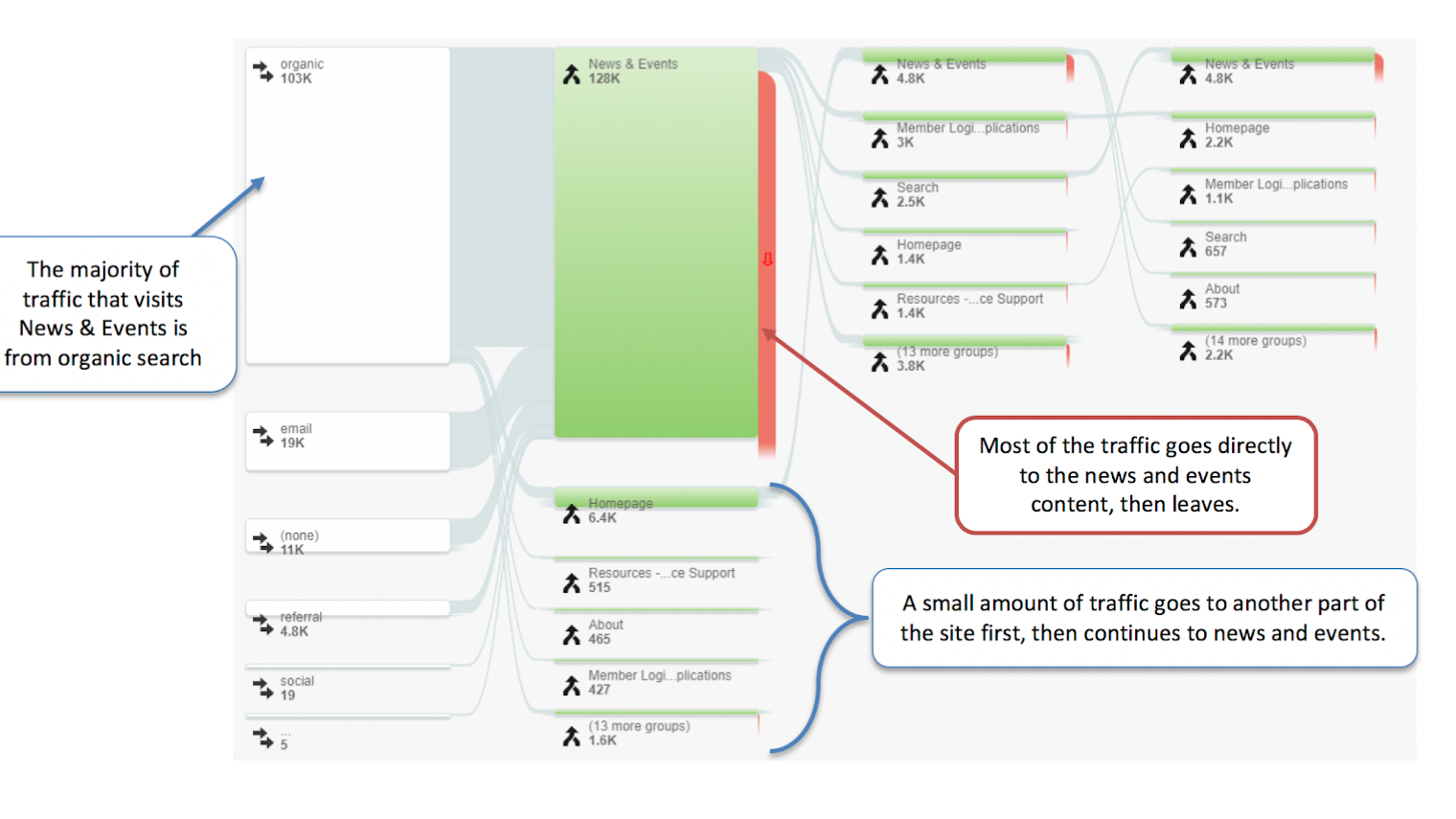
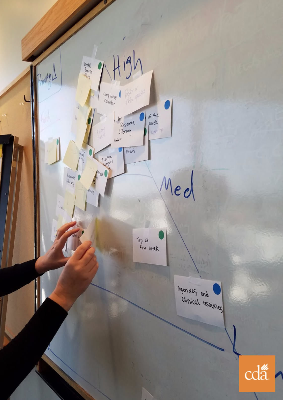
Subject matter experts were consulted to get their take on the current state of the website and what they hear from members. We also sat with our customer care representatives (who were conveniently located on our floor) to listen in to calls they recieved from members to either renew their insurance, take courses for their credits, or to get help finding documents on our websites. Finally, we gained a lot of insight from our site analytics and began sotryboarding our findings.
Information Architecture
To better understand the structure of our existing website, we created numerous sitemap. These helped us gain a clear overview and allowed us to better organize the information for the new redesign. We were also able to work with SMEs to gain their feedback on what pages were safe to remove or consolidate.

UI Kit / Design System
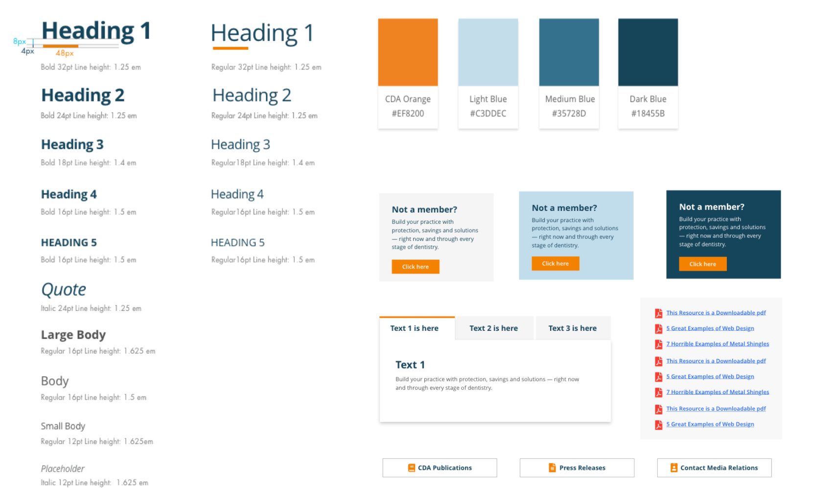
Our UI Kit reflected our new brand colors and guidelines. We ensured we met WCAG web standards for accessibility. Creating a shared library for designers and developers to pull resources from allowed for consistency and efficiency.
Our components were built out for the DNN platform where our developers could easily access blocks of code they needed to build our pages. While the upfront effort was great, we made up for it on the backend.

Wireframes
We started with mid-fidelity wireframes that we tested with our end users by presenting them with scenarios to find various pages or links and observing their actions. Each session provided us with better insight and our desigs matured over time.
Prototype
Once we felt confident in our user test results from our wireframes, we moved on to our high-fidelity prototypes. Here were began to add in our new branding colors, imagery, and components. We did a few more rounds of testing with end users to ensure readability and usability were up to standard. We recieved high praise for our designs and the entire company was feverish with excitement over our efforts.
The next step was to begin development and as our developers were heavily involved in the research and brainstorming sessions they were eager to begin building.

Development
The previous website was built using DNN. By building ou new site on the same platform, developers were able to upgrade to the latest version and apply all the best practices they had learned throughout the years.

Looking Ahead
The site launch was a huge sucess. Members loved the new layout and we saw engagement go up especially on mobile devices. Any last minute fixes we needed to make were much easier to implement as our processes for change requests were now streamlined.
Going forward, we do need to train our SMEs on how to edit their own content on the website. We also need to continue working on our site map to ensure we keep a living document with our current urls and action items.